Showing posts with label painter. Show all posts

Sunday, 9 November 2014

Peder Balke and Norwegian landscapes at the National Gallery

On the 12th November, a new exhibition of 50 paintings by the 19th century Norwegian artist Peder Balke (1804 - 1887) will open in the Sunley Room of the National Gallery in London. Admission is free and the exhibition will continue until 12th April 2015. Most of the paintings have never been seen before in the UK.

This exhibition continues a theme of exhibitions of landscapes by Scandinavian artists in recent times. Previous ones have included
This exhibition has been organised by the Northern Norway Art Museum, Tromsø, in collaboration with the National Gallery, London.  The paintings on display include ones from private and public collections across Europe that represent every facet of the artist’s career.

Peder Balke, The Mountain Range ‘Trolltindene’, about 1845
Peder Balke, The Mountain Range ‘Trolltindene’  c.1845
Collection of Asbjørn Lunde, New York
© Photo courtesy of the owner
There's a video on YouTube of his paintings with some rather marvellous music

Saturday, 24 August 2013

Angela J Simpson's plein air painting kit

Angela J Simpson's Plein Air Painting Kit

Angela J Simpson is an artist, illustrator and landscape architect who works from her home in in the Scottish Highlands. Recently she has been challenging herself to produce a daily pochade which she then posts on her "diary without words".

Last month she wrote a post on her blog about My kit for painting outside in which she explains what she takes and why.

I love her additional photo of her thumb box and explanation - very funny!

Thursday, 25 July 2013

Bill Guffey's plein air painting kit

Following on from the last post about an artist's plein air equipment. here's Bill Guffey's kit which he explains in this post - My Plein Air Equipment on his blog Bill Guffey.

See a larger version in Bill's post
You can see larger images of the kit on his post - just click an image in his post to see the larger version.
I hope this gives you an idea of what, how and why I pack what I do to go paint in the great outdoors. If you have any questions, please let me know and I'll see if I can answer them for you.
Bill is a Kentucky artist who paints in oils.  He's a member of the American Impressionist Society and an associate member of the Oil Painters of America. You can see Bill's paintings on his website http://bnguffey.com/

He founded the Virtual Paintout blog for those painting from views seen via Google Paintout.

Links to more posts on this blog about Bill Guffey:

Saturday, 15 September 2012

Winslow Homer's Studio at Prout Neck

This is a slideshow of photos of Winslow Homer's Studio at Prout Neck in Maine - plus a Vanity fair article on the studio and his painting habits  It would seem Winslow Homer was pretty smart as to the timing of paintings to satisfy the seasonality of people's interests

Winslow Homer West Point, Prout's Neck

West Point, Prout's Neck (1910) by Winslow Homer [Public domain], via Wikimedia Commons

It looks as if tours of the studio where he settled in 1883 are about to start.  This is an extract from the Portland Museum of Art's website relating to The Year of Winslow Homer
Walk in Winslow Homer's footsteps.
The Portland Museum of Art is pleased to offer tours to this National Historic Landmark beginning on September 25.
Reservation details »
In addition, the Museum is having an exhibition Homer's Prouts Neck Home (22 September - 30 December 2012)
To celebrate the opening of the newly renovated Winslow Homer Studio at Prouts Neck, the Portland Museum of Art presents Weatherbeaten: Winslow Homer and Maine. This extraordinary exhibition showcases 38 masterpieces that the great American artist Winslow Homer (1836-1910) created during the final decades of his life, when he lived and worked in Maine.
For more about Winslow Homer see my website - About Winslow Homer - American Artist

Friday, 3 February 2012

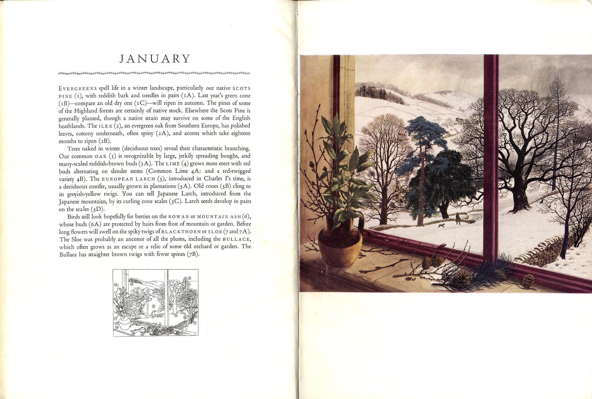
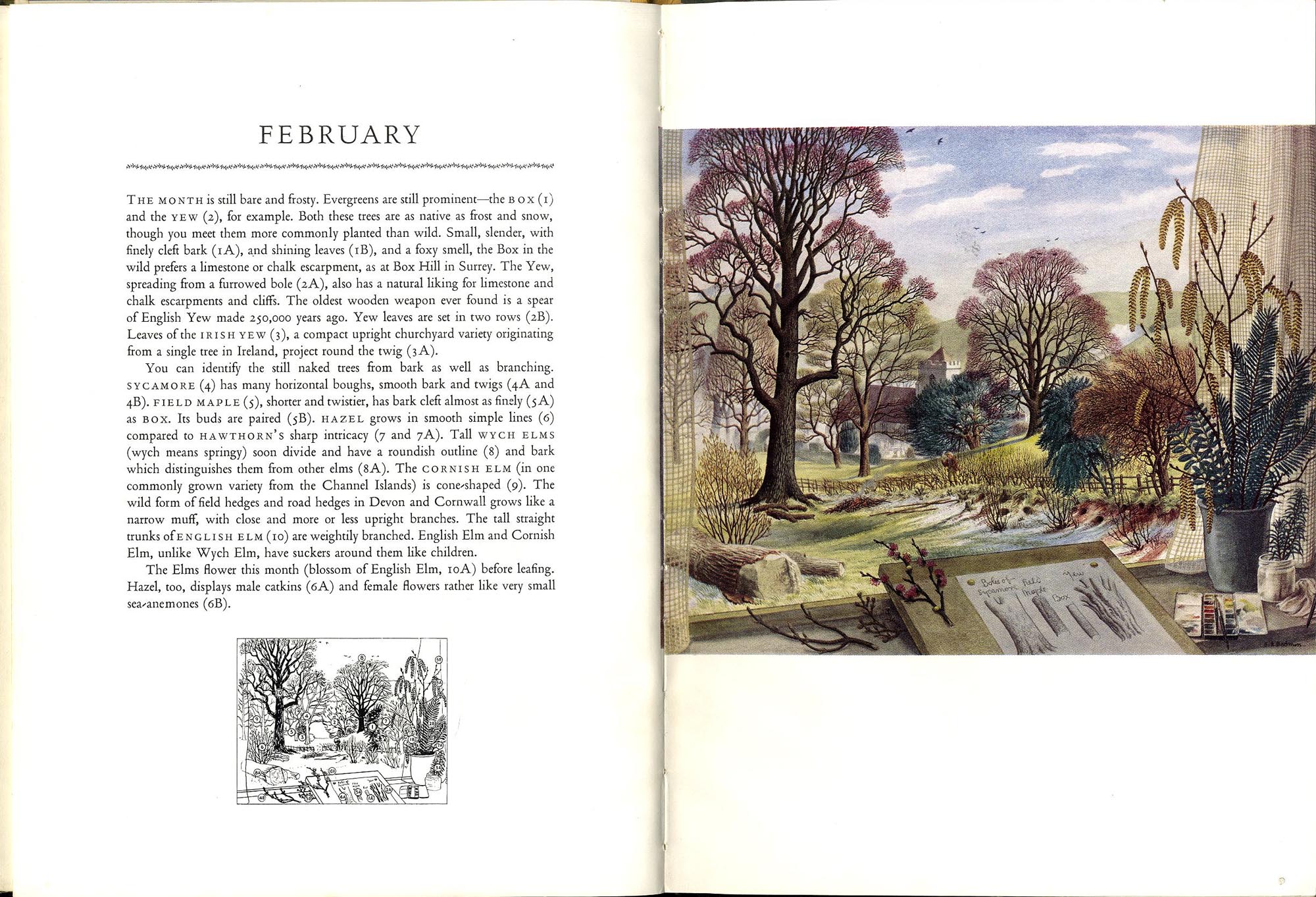
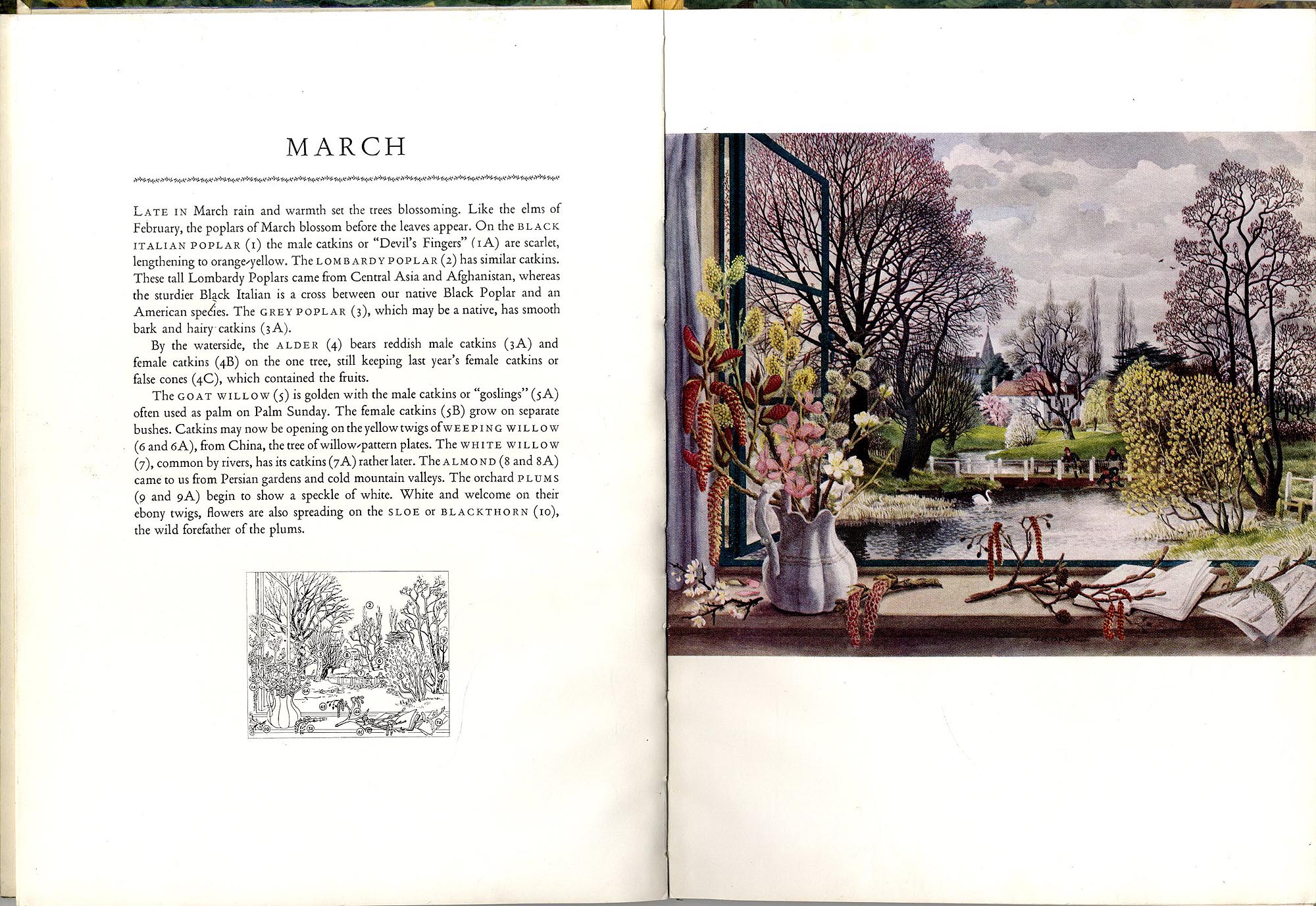
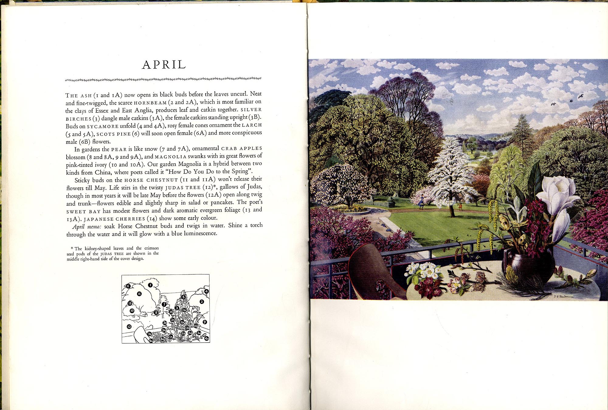
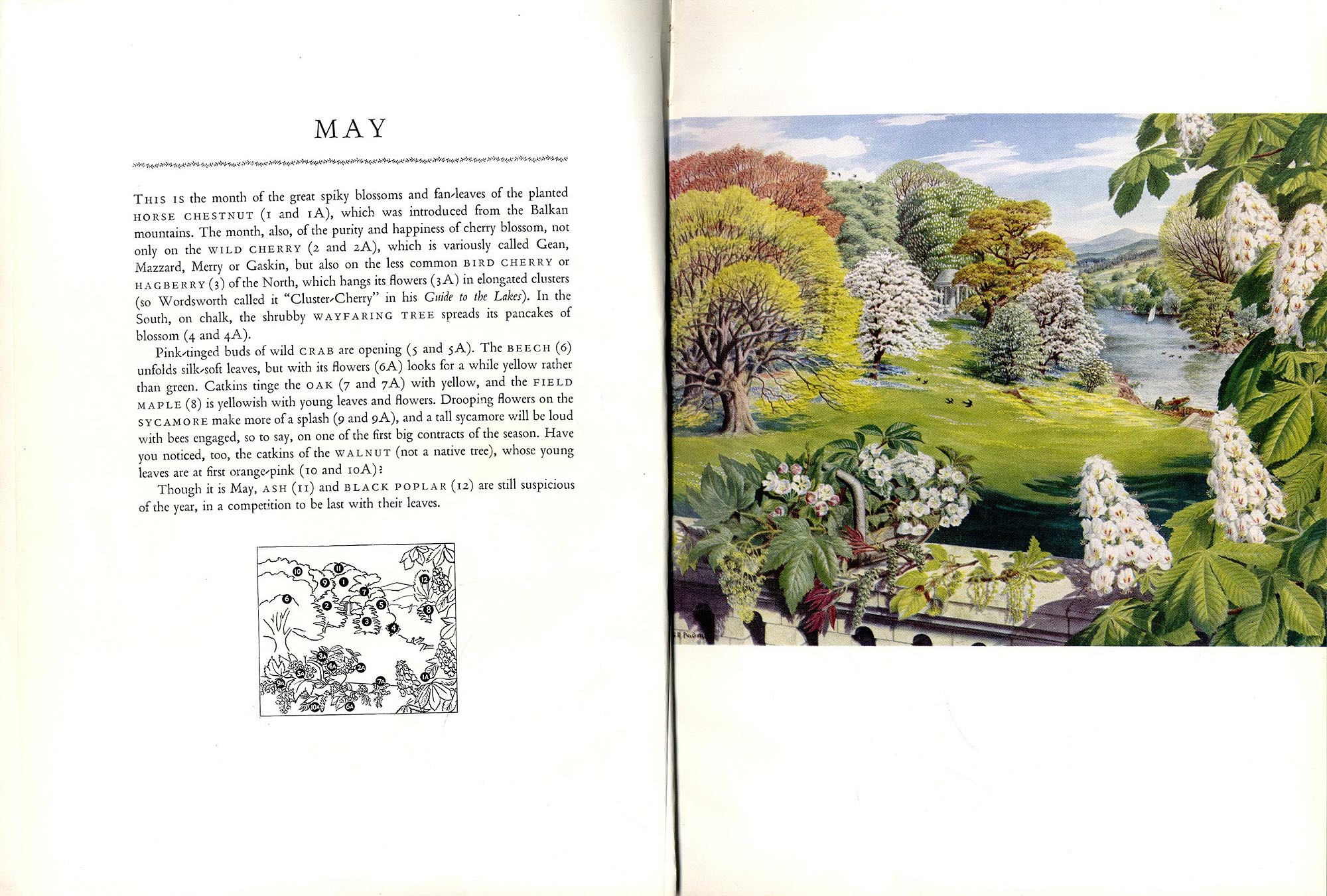
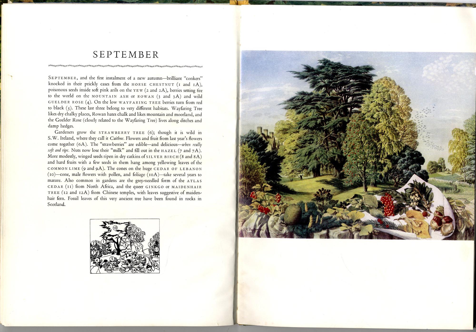
"February" by Stanley Roy Badmin RWS

At the Watercolours and Works on Paper Art Fair today I saw a painting called "February" by Stanley Roy Badmin RWS (!906 - 1989)

February by Stanley Roy Badmin
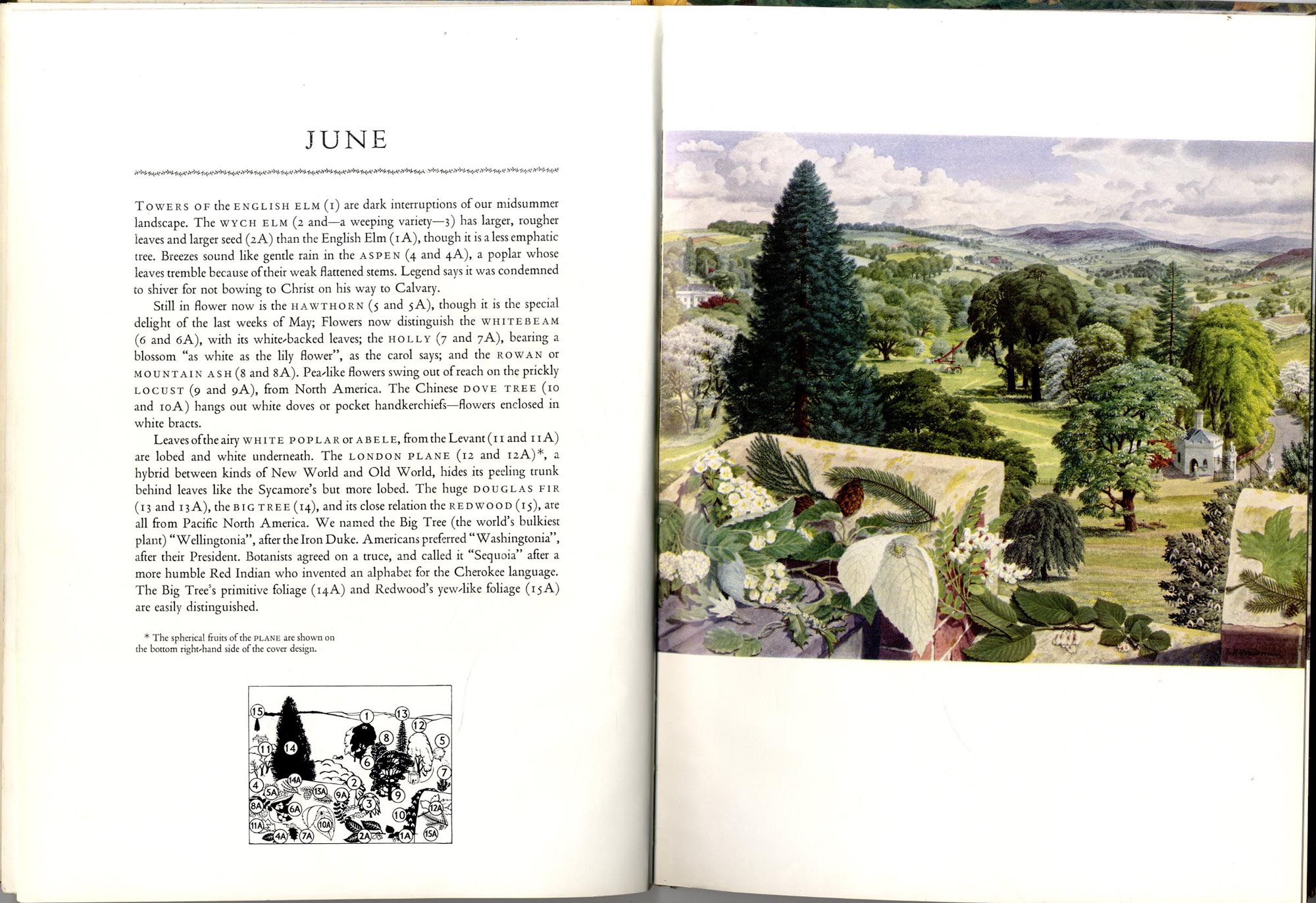
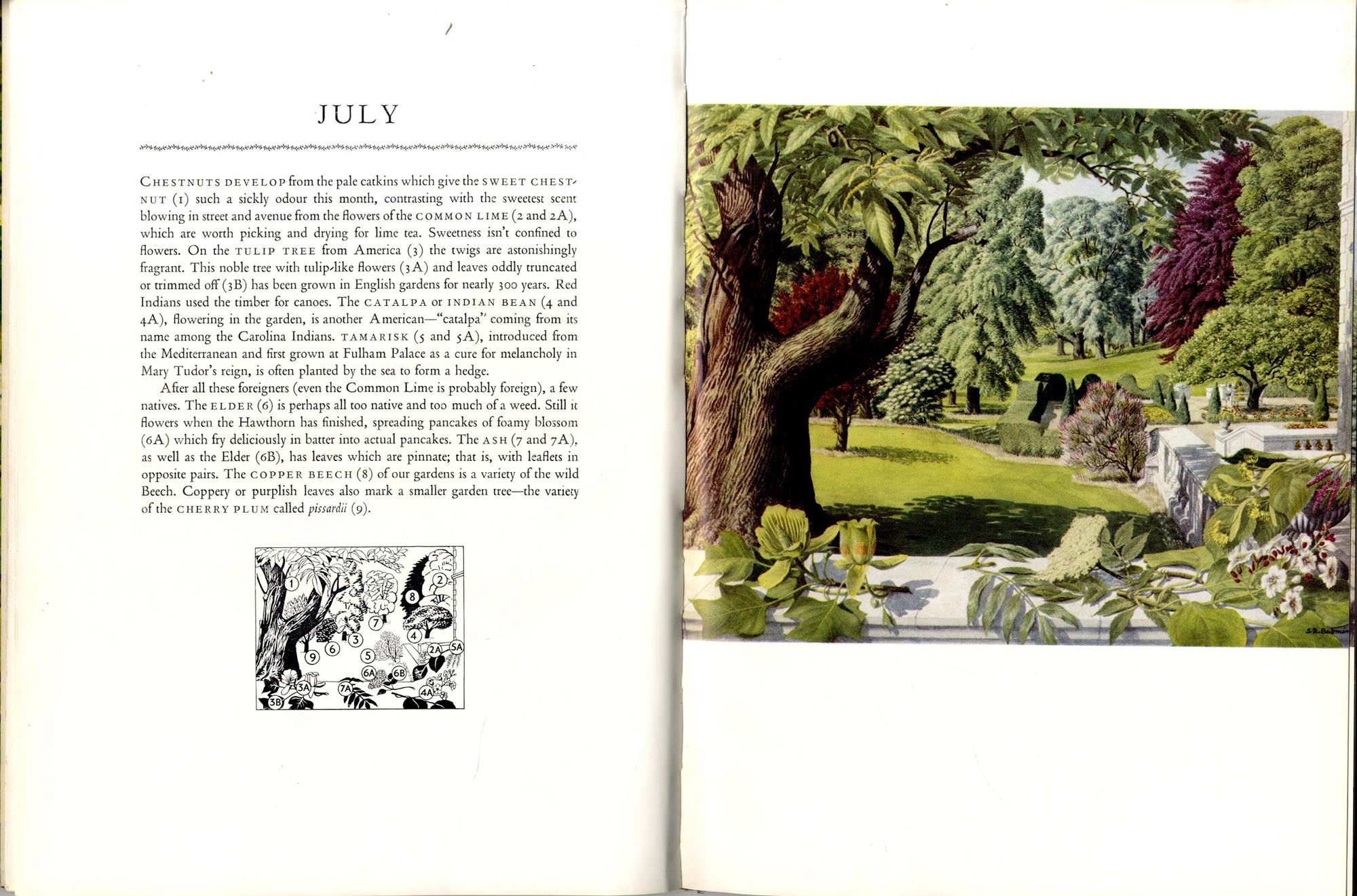
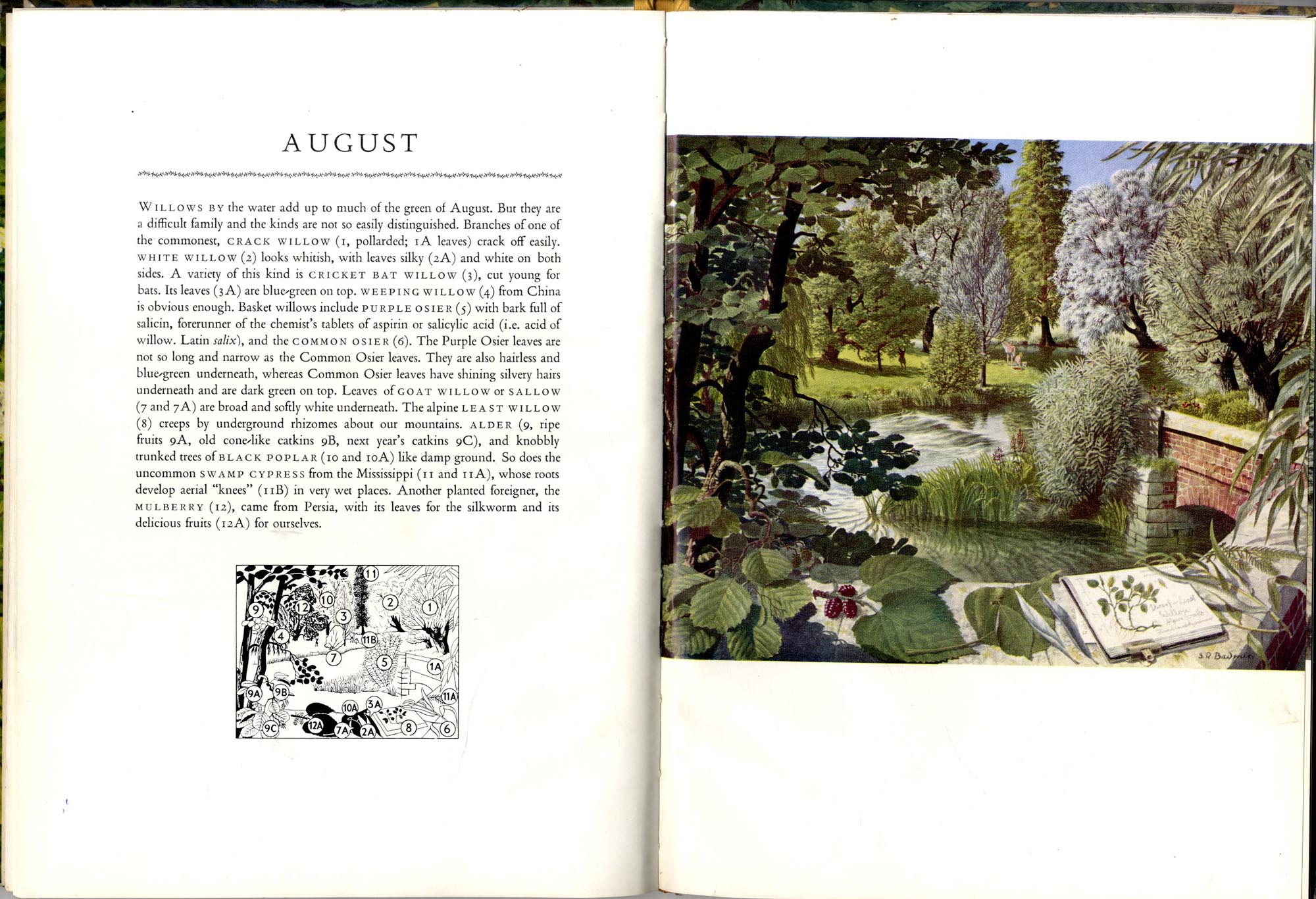
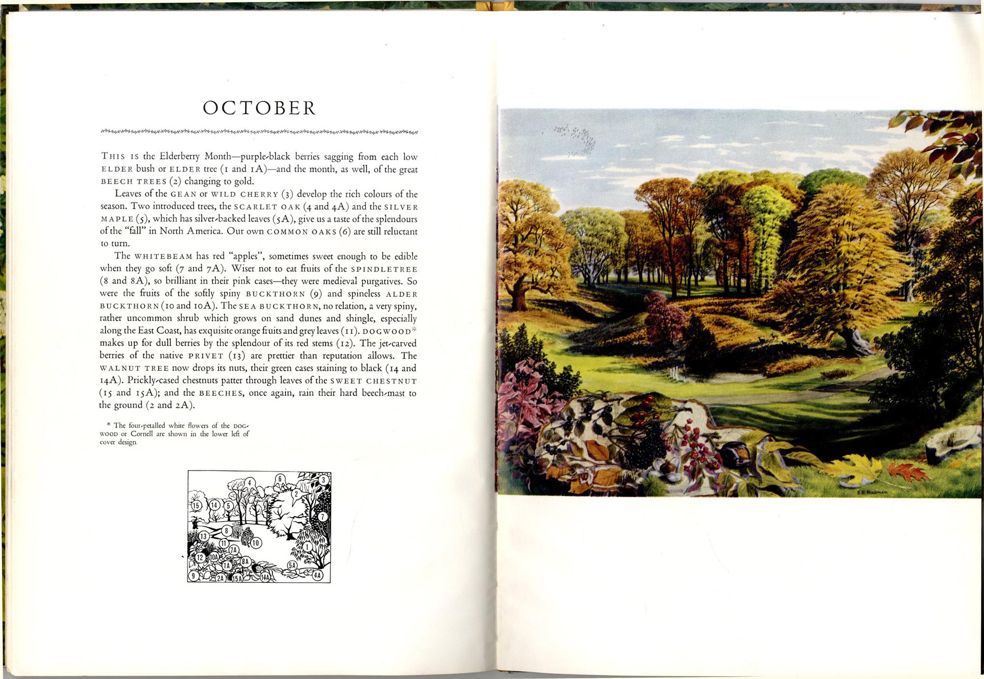
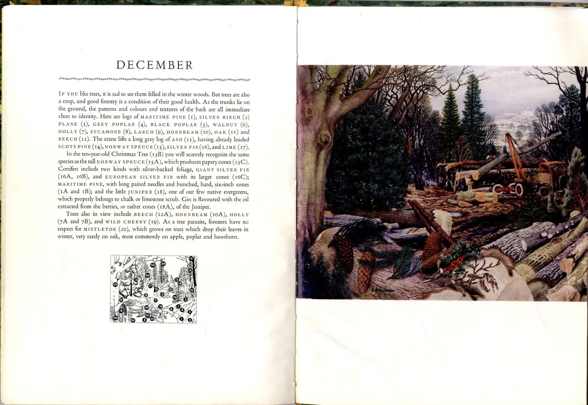
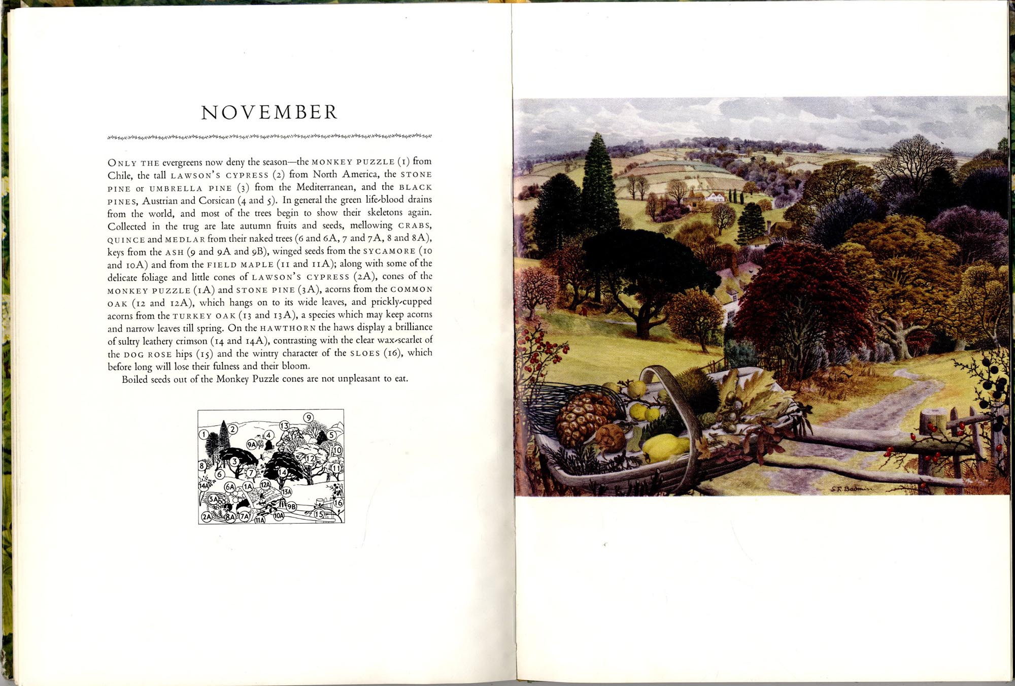
I was reminded that his paintings used to be used for the series of Shell maps and the Shell Posters The Key to the Countryside which were produced when I was a child.  We used to have them up in my classroom at primary school.
Stanley Badmin was born in London. He studied at Camberwell College of Arts and at the Royal College of Art from 1924-1928. He taught at various London art schools, including Central School of Arts and Design from 1954. His work was based on the English countryside and the rural way of life, worked mainly in watercolour and pen and ink. His engravings had a distinctive carefully wrought style. Badmin contributed to numerous books, including Trees in Britain, published in 1943 by Puffin Picture Books, periodicals, adverts and posters for London Transport and Shell amongst others.
British Council - Stanley Roy Badmin
It's amazing how one painting takes you right back.  Particularly because I always used to enjoy his illustrations of the countryside.

His painting was very much rooted in the English countryside and his particular area of expertise was portraying all the different species of trees.  He produced the Ladybird Book of Trees, a Puffin book called Trees in Britain and a book called The Shell guide to Trees and Shrubs  - in which this painting illustrated February.

I found a very good version of it online and here are the links to every month - each with a different landscape of trees - enjoy!

I've just ordered a copy of this delightful book from Amazon!

There are some links below which tell you more about this very English watercolour painter of the English landscape.

Links:

Friday, 16 December 2011

Film of Claude Monet painting waterlilies at Giverny

Below you can see a short film of the Impressionist painter Claude Monet at work on one of the paintings in his series of paintings of the nympheas (waterlilies) in the water garden at his home in Giverny in Normandy.


All plein air painters will wish to note:
  • the white suit he is wearing - which has no marks from paint!  Monet is always wearing a suit when photographed while working.  We can only assume this is summer!
  • the very large palette he is using
  • the fact that the canvas is absolutely rock steady despite what is obviously a very blustery day.
Claude Monet (on right) in his garden in Giverny 
with an unidentified visitor in 1922
Source: Wikipedia
It's preceded by a very short film of him talking with a man in the Clos Normand (the flower garden) at Giverny.  If you study the background we can see that Monet was a cat person!

The general consensus is that Monet was probably filmed in the early twentieth century.  The colour of his beard suggests he's older than he was in the famous photograph of Monet by Nadar in 1899.  He looks more like the figure photographed in the water garden in 1922 (see photo on right).

Monet was an inveterate painter of gardens and always painted the gardens of the houses he lived in (see Making A Mark - Gardens in Art by Claude Monet for previous posts I've written on this topic).

The garden at Giverny is an example of Monet creating his very own place to paint - with a separate flower garden and water garden.

I came across the film (which was uploaded to YouTube by nickwallacesmith) on the Painting Perceptions blog.  This has a post with some useful observations about Monet's habits as a plein air painter.

Monday, 28 November 2011

Autumn in DC - Autumn Landscapes #9


More about Autumn in Washington DC - Kathryn Law (Kathryn Law) wrote to me
I just returned from a trip to Washington DC where I did five little paintings while taking a break from museum-crawling. We don't really get these kinds of fall colors in San Diego, where I live, so these brilliant yellows and reds just grabbed me and wouldn't let go. The one at the top of this blog post was done as I sat with aching feet, eating a sandwich, on my way from the National Gallery to the Smithsonian Art Museum. I looked to the left and there was this scene.
Kathryn has a BFA in Painting and has been a professional artist since 2002, living in San Diego. She is currently the Artist in Residence at Cabrillo National Monument.


How to get your paintings of Autumn posted on this blog

This is the ninth post in my series of Autumn Landscapes by art bloggers. If you're interested in having your images displayed as part of the seasonal changes.  I'll be starting the Winter Landscapes soon.
  • drop me a line (see side column for email), 
  • reference the blog post in which I can see the painting 
  • and (this is important) use Readers Autumn Landscapes in the subject line of your email (This is so I can find it in the masses I get each day!)
Places to Paint: Please note that I'm also interested in the place as well as what led you to paint it in Autumn.

I can't promise to display all that I'm told about. Plus there is an absolute rule which is that this is for art bloggers only ie "no blog post, no feature on my blog".

Thursday, 27 October 2011

Plein air painting demo by Bill Guffey

Bill emailed me to say he's put a plein air painting demo up on YouTube - and here it is - enjoy the brush strokes in time to the music!

If you are also doing videos of yourself painting landscapes plein air - or even in the studio do let me know.


This plein air oil painting demonstration was filmed on October 23, 2011 at Dale Hollow Lake State Resort Park in Cumberland County, Kentucky.

The painting is 24" x 20" and was completed in about an hour and 20 minutes. I knew traveling to this location was going to be a race against the sun and time. The camera battery ran out about 10 minutes before the painting was completed. A shot of the finished painting ends this short film.

You can see more of Bill's work on http://billguffey.blogspot.com/

Saturday, 16 July 2011

The Landscapes of Georgio Morandi

Larry Groff (Painting Perceptions), a landscape and cityscape painter living in San Diego, has written an  excellent blog post about Giorgio Morandi, The Essence of the Landscape.

I'm with the person who commented to the effect they had no idea that Giorgio Morandi did landscapes as well as still life.

Here's a YouTube video of some of Morandi's work created by Groff - but I do recommend you take a look at the post too.


Here also is what Larry says about his blog.  His sentiments for starting the blog are certainly ones I can identify with and it looks like one which will get added into my Google Reader list.

After painting for about 30 years I’ve often felt discouraged that perceptual painting has often gotten less attention in the major art publications, online venues and art world in general compared to conceptually-based artists. Eventually I asked myself, “why not start a blog devoted to modern painting done from life?”


There are magazines, like American Artist, which has articles about some very good contemporary realists working from life but many of the articles lean towards a more conservative and non-modern style. There are blogs and forums on the web which focus more on academic realism or photorealism but there is little to be found in magazines or blogs that specifically focuses on perceptual painting with a contemporary modern sensibility. This blog aims to correct that problem.

Sunday, 29 May 2011

Wolf Kahn - on painting and being a landscape painter

"A painting with content" (Video 2)
"I was trying even then to do something I'm still trying to do - to get away from description and at the same time still be a landscape painter"
Wolf Kahn

This a two part interview with Wolf Kahn - the renowned landscape painter who works in both oil and pastels.

The two videos from 2008 are from New Art TV

In the first he talks about the earlier part of his life and how his artwork developed and was influenced by the philosophies and contemporary art movements of the fifties.


This is the second part of the interview with Wolf Kahn in which he describes how he got launched and started to sell seriously

"I'm constantly trying to get away from the deliberate...and intentionality"
Wolf Kahn


Thanks to Debora L. Stewart (Contemporary Asbtract Pastels) for alerting me to the videos

Links:

Friday, 21 January 2011

Painting tropical landscapes in Bali


Rice paddies, Ubud (SOLD)
12cm x 17cm (4½"x7") oil on board
Copyright Julian Merrow Smith
I'm having a lovely time at the moment revisiting - via Julian Merrow Smith's paintings of the paddy fields and tropical landscapes of the island of Bali in the Indonesian Ocean.

Postcard from Provence has temporarily relocated to Bali in Indonesia.  I'm loving it because this is an island I've visited twice - in 1992 and 1997 (see my sketchbooks here Katherine Tyrrell travels with a sketchbook - in Bali)

The critical thing about tropical landscapes in places like Bali is to forget every colour you usually use for greens and to start afresh assessing the colours of the landscape - the green is vibrant and the browns are sundried - and the colour of the water obviously depends on what the sky is doing!  The other thing I remember is that the quality and the nature of the shadows are completely different.  Partly because of the strength of the sun but also because of the humidity in the air.

Julian is doing a fabulous job of capturing Bali as I remember it. He's even painting the places I know well - rice fields near Ubud (the artist's village) and Penestanan in the north of the island and Tanah Lot on the south coast.  You can see a photo of him painting the paddy fields in Ubud at the top of this post on his wife Ruth's blog - The first day in Ubud

Here's two more samples of his work in the paddy fields.  You can see paintings of the coast on his blog and follow him by subscribing to Postcard from Provence (in Bali).


Track through rice paddies, Penestanan (SOLD)
20cm x 16cm, oil on board
Copyright Julian Merrow Smith

Temple in the paddy fields (SOLD)
20cm x 16cm oil on board
Copyright Julian Merrow Smit

Here's part of my comment on Julian's blog - about the Penastan painting

My goodness - this takes me back. I've walked through these paddy fields in Penastan. I've even walked them in the dark and very nearly fallen into them! Try walking along the edge of a paddy field after it's dark with a pencil torch!

You are absolutely spot on with all the colours - the lush greens and the faded muted browns. You're really catching the shapes and the look of that part of Bali.
Have you ever been to Bali?

Do you have any tips about painting tropical landscapes?

Saturday, 27 November 2010

Townscape: Covent Garden Market

Covent Garden Market by Balthazar Nebot c1744
oil on canvas, 35 x 48¼ in. (86.8 x 122.6 cm.)

Yesterday I was sketching in Covent Garden (see Travels with my Sketchbook) and was reminded of the many artists who have painted Covent Garden Square and market.

This is an eighteenth century painting by Balthazar Nebot of Covent Garden Market.  He did a number of very similar paintings of this view - one of which is in Tate Britain.  This is their description of their painting.
Nebot’s view of Covent Garden looks west towards St Paul’s Church. It records the activities and architecture of Covent Garden which, by the 1730s, was at the heart of London’s artistic community. It was a popular urban subject, also painted by Samuel Scott, amongst others.
The market was first developed in the 1650s. Twenty years later the Earl of Bedford was given permission to ‘hold forever a market in the Piazza on every day in the year except Sundays and Christmas Day for the buying and selling of all manner of fruit, flowers, roots and herbs’.

Paintings of townscapes are fascinating in terms of revealing to the modern eye just how old some buildings are.

The whole of the background of this painting is still in existence - St Paul's Church designed by Inigo Jones is the greek temple looking building left of centre and the brand new Apple Store in Covent Garden now occupied the building on the extreme right (with the colonnades) - which is where I sketched yesterday.  I gather it's the largest Apple Store on the planet!  How things have changed......

This is a description of the artist Balthasar Nebot who was active between active 1730-after 1765 based on that on the Tate website which in turn is based on Elizabeth Einberg and Judy Egerton, The Age of Hogarth: British Painters Born 1675-1709, Tate Gallery Collections, II, London 198.  The links are 
Painter of open-air genre scenes, topographical landscape and some portraits 
Life obscure. Waterhouse (1981, p.255) records that he was of Spanish origin and married in London 1729/30.  Harris (1979, p.160) suggests that he established himself within a circle of genre painters working in and around Convent Garden, including Peter Angellis (q.v., whose subjects of fishmongers' and vegetable-sellers' stalls are close to Nebot's), Joseph van Aken (q.v.) and ?Peter Rysbrack.  Known for his paintings of market scenes in the 1730s
It's always struck me that there are many more artists who specialise in landscapes rather than townscapes - or topographical pictures of towns. 

In future I'm going to try and feature more artists who specialise in this specialist type of "landscape" painting - and to highlight how topographical paintings often tell the story of our culture and history.

Monday, 12 July 2010

Singer Sargent: Where's the place in this painting?

On Tuesday last week, Richard Ormond, great nephew of John Singer Sargent and Editor of Sargent's Catalogue Raisonee, revealed that his great uncle was no great archivist or recorder of where his landscapes were painted.  (see Sargent and the Beach for my review of the Sargent and the Sea  exhibition at the Royal Academy of Arts)

However a Catalogue Raisonnee should try and provide this level of detail so the production of every volume of the catalogue of Sargent's work requires trips to locations where the artist worked to try and work out the locations of different paintings.  He gets quite a lot of help from fans of Sargent's work and people living in the locations where Sargent painted.  One of the problems which can occur is that places have changed a lot since the late nineteenth century and it can be very difficult sometimes to identify a specific location.

The painting below had originally been attrubuted to "a trip to Morocco".  He told us that this ended up in him walking up and down a fair few beaches in Morocco trying to find it without any success at all.

Beach scene, Marina Grande, Capri (1880)
John Singer Sargent
Oil on panel, 25.4 x 34.3 cm

Private Collection | Image courtesy Royal Academy of Arts

It then turned out that, while researching the paintings of Capri, an individual identified the painting and said "that's not in Morocco - that's the Marine Grande!"  The instructions were to return to the harbour, go to the extreme left and then look left - and the scene would look like the painting.

If you go to the Marina Grande, Capri on Streetview one can see that is in fact the case!

This now makes the reference to the painting in the catalogue of the exhibition completely wrong - but then catalogues are always being updated as information improves.

Here's the remainder of the description of this painting.
A gaggle of local women are seen laying fishing nets to dry.  the white sand and dense blue sky evoke the brilliance and saturating heat of a sunlit day on the Mediterranean coast."
extract from Sargent and the Sea by: Sarah Cash, Richard Ormond
I wonder if Streetview will be able to provide the answer to the challenges of an editor of a catalogue raisonee?
 
You can find out more about Singer Sargent and his work from my information website - John Singer Sargent - Resources for Art Lovers

Note:   
  • a catalogue raisonné is a monograph giving a comprehensive catalogue of artworks by an artist.
  • Richard Ormond was formerly Director of the National Maritime Museum from 1986 until 2000 and formerly Head of the Picture Department from 1983. He was the Nineteenth Century Curator and latterly the Deputy Director of the National Portrait Gallery from 1975 until 1983. He is a Victorian Painting specialist with a particular interest in John Singer Sargent and Lord Leighton. With Elaine Kilmurray, he is producing the Catalogue Raisonee for John Singer Sargent which runs to several volumes.
  • Sargent and the Sea - the exhibition catalogue by Sarah Cash, Richard Ormond (Yale University Press October 27, 2009)

Saturday, 15 May 2010

Sketching Constable's Cornfield

After Constable's 'The Cornfield' (1826)
 9" x 6", pen and sepia ink in large Moleskine Sketchbook
copyright Katherine Tyrrell


I spent yesterday evening (see Museums at Night starts tonight!) in the National Gallery in London sketching John Constable's The Cornfield in pen and sepia ink.
The title seems first to have been used by the subscribers who presented the picture to the National Gallery. Constable referred to it familiarly as 'The Drinking Boy'. It probably shows a lane leading from East Bergholt towards Dedham; the distant church could be an invention.

The painting was exhibited several times during Constable's lifetime, first at the Royal Academy in 1826.
It's interesting that even though it's supposed to be of Fen Lane near his home, he's used artistic licence and introduced a church into the background.  fen Lane is now called Flatford Lane.

I like sketching large paintings in art galleries and museums in monochrome.  It means you look at it more closely while trying to detect the design of the tonal values.  I also don't try to be precise when I sketch.  Most of this is done with scribble hatching - although I start to work smaller and smaller areas as I progress.

It's also fascinating trying to sketch the paintings of artists who themselves frequently used a sketchbook as a start to creating their paintings of landscapes.  I've seen Constables sketchbooks and they're tiny but very effective!

It seems likely that the painting in the National gallery was painted from sketchbooks and an initial start on site.

I think this painting in the Tate is the same view the other way on.  Its caption is as follows
Constable and his wife Maria took a long holiday in Suffolk in 1817. This was to be the last time he painted directly in oils in the vicinity of East Bergholt. Constable began several canvases outdoors without finishing them, perhaps in order to secure as much fresh material as possible in the time. Some parts of this canvas are painted to a fair degree of finish, whilst others are left in a more sketchy state.

Fen Lane, East Bergholt
John Constable

I think I might try and locate the original site for both these paintings. There's a good guide to walks around Flatford and East Bergholt including one which identifies Fen lane on the AA website - see Constable Country at Flatford Mill.

The bend appears to be round about #3 on the map!

Monday, 26 April 2010

Charles Reid's 5 Tips for Painting Water

Water is one of those subjects which can be difficult to master in any media. It's always good to get tips from those who have mastered their media as well as the subject matter.

Today's post comes from the Watercolor Artist blog via the South Africa Society of Artists and their post Charles Reid's 5 Tips for Painting Water

watercolour painting by Charles Reid
Here's a little gem we plucked from our archives:

Charles Reid's
best tips for painting water:

1. Water should be painted with hard edges between the light from the sky and the reflections from trees, buildings or boats.
2. Paint wet-in-wet within the reflections but rarely where the reflection meets the sunlight.
3. For distant water on the horizon, try moist Antwerp blue or peacock blue (Holbein). Sometimes I use ultramarine violet if the horizon line of the sea seems very dark.
4. In shallow water, use diluted Antwerp blue, peacock blue or Winsor blue. These are all transparent blues that retain their color identity when diluted.
5. Sometimes water near the shore can turn a delicate turquoise green. You can add turquoise green to your palette, or simply mix diluted cadmium yellow pale or lemon yellow with one of the diluted blues to achieve the same color.
I can certainly recommend Charles Reid's books about painting in watercolour - as can others. See my information site about The Best Books about Watercolour Painting for more information.

Advice and information from The Watercolor Artist is also available as follows

Sunday, 18 April 2010

Pictures of Britain by David Gentleman

'Reed-beds at Iken Cliff, with skeleton oak and Iken church 
(illustration from Ask The Fellows who cut the Hay)', 2009
The Fine Art Society / copyright  David Gentleman 

A lot of UK readers of this blog will be very familiar with the watercolours and drawings of topographical artist David Gentleman, who was 80 last month.

Many of his images are of landscape scenes and buildings around the UK - in books like David Gentleman's Britain (Phoenix Illustrated

I know the view of Iken Church in Suffolk which is pictured at the top of the page.  It stopped me in my tracks when I saw it and reminded me that it's one of those locations that I need to go back to!

You can see many more images of his work at:
  • 46 works (lithographs etc) online in the Tate Collection
  • in a new exhibition by the Fine Art Society in Bond Street and on their website David Gentleman at Eighty (24th March - 15th April) which unfortunately has just finished.  However you can still see the works online. I have sense that there has been no post-production mainpulation of the photographs - and wonder whether they were actually painted on grey paper or whether it was the lighting when the photographs were taken
  • at Cambridge Book and Print Gallery
You can also read about him and see some of his artwork in:
Theer doesn't appear to be a website - more's the pity.


    Monday, 5 April 2010

    Ambrogio Lorenzetti - the first panorama


    The Allegory of Good and Bad Government
    Siena in 1340: 

    Good Government: (top) the town (bottom) the countryside (1338-40)
    Ambrogio Lorenzetti
    about 6 foot 6 inches high


    In the Palazzo Pubblico in Siena is one of the most amazing paintings ever created. It's actually a fresco on three walls.

    It's a painting of the town of Sienna and the countryside round about in the fourteenth century - under good government and bad. It's not in the best of conditions but that's partly because it was painted in 1340.

    However the real significance of The Allegory of Good and Bad Government by Ambrogio Lorenzetti is that these frescos are probably the first landscape and the first townscape paintings ever completed. They are certainly the oldest paintings which have survived

    I've seen them, very fortunately in the company of a painter who used to teach art history, and these frescos are sensensational. I could have spent a very long time in in the Hall of the Nine (also known as Sala della Pace). I came away with a very long scroll which shows the frescos in their entirety.

    It's just worth bearing in mind that this fresco is 6 foot 6 inches tall and each of the long walls are about 45 feet long. You can get a sense of its size in this photograph which shows most of the good government side.

    The paintings were created as a symbolic way of the government of Siena impressing on local people what was needed. This at a time when famine and pestilence were not uncommon features of everyday life in the dark ages.

    The idea was that the business of government should be left top the nine merchants who were responsible for commissioning it - and who met in the room in which it is now situated. In essence under good government Siena prosperred and under bad government it disintegrates.

    The principles which were symbolised in the frescos were those which meant Siena had enjoyed some 70 years of good government.

    This is an extended extract from an excellent lecture by Dr. Richard Ingersoll, Rice University which is the best explanation of the painting which I can find on the Internet.
    In the meeting chamber of the Noveschi, the Sala della Pace, is one of the great documents of the political ideology of a medieval citystate, part inscription and part painting, known as the cycle of Good and Bad Government. The frescoes were painted in 1340 by Ambrogio Lorenzetti, who was evidently a member of the group of the ruling class and known, aside from his skill as an artist, for his wide knowledge of political theory. It is an extraordinary painting, quite unlike anything that came before or after it: it combines realistic visions of the landscapes of the good city and of the bad city with allegorical formulas of the virtues needed to accomplish good government. Using pre- perspectival spatial recession, Lorenzetti creates a marvelously unified view of the city and the country. The painting is a manifesto, and like all propaganda was intended as a reinforcing vision to those who were already convinced-- a lesson for the members of the Nine, who rotate every two months, reminding them of their values and goals.
    I want to spend some time analysing Lorenzetti's painting as a way of concluding about the Medieval city. You were meant to view it from left to right, from the Bad city to the good city. The wall devoted to the Bad city is a reminder of the "Landscape of Fear" mentioned earlier from which society had emerged. It is inhabited by monsters, commonly reported in the harder times before the year 1000. Flying above the city gate is a ragged harpy figure labeled "Timor", or Fear, who brandishes a sword and carries a sign reading "Because each seeks only his own good, in this city, Justice is subjected to Tyranny; wherefore along this road nobody passes without fearing for his life, since there are robberies outside and inside the city gates." Below her we see the countryside ablaze with burning buildings and looting, abandoned fields, bridges blocked by soldiers. The gate to the city is also blocked by soldiers and inside the city is a mess, buildings are being torn apart, people are fighting, women are being raped. This city is like Dante's description of hell as "una citta dolente," a suffering city, and lives up to the city of the old feudal order. Next to the scene of the Bad city are the allegories of bad government with the horned figure of Tyranny in the center and with Justice bond at his or her feet.
    On the next wall is the allegorical chart of Good Government where the figure of Justice as a fulcrum for the scales, is balanced with the crowned figure of il Buon Comun (the common good); they are linked by a rope, which passes by a figure named Concord (a pun for "with the rope") and 24 well-fed figures holding on to the rope in solidarity. The figure of peace, lounging on armor occupies the center of the composition and has given her name to the room. The appeal to justice is everywhere: "This holy virtue (justice) wherever she rules, induces to unity the many souls of citizens and they gather together for such a purpose to make the Common Good their Lord. Quite literally common good has precedence over self-interest. The picture makes clear that this is not a regime based on amnesty: justice is seen beheading those who deserve it and opposite the burghers is the city's militia having captured the thieves and enemies of the state and put them in chains: one of the major construction projects of the age will be the prison added to the rear of the Palazzo Pubblico.
    Finally there is the portrait of the Good city, an idealization of Siena that showed it not in realistic detail but in rhetorical detail. As an answer to the other wall's Timor is the inscription Securitas (safety) and a blithe victory figure semi-clad holding a gallows and flying over the city gate with the inscription: "Without fear every man may travel freely and each may till and sow, so long as this commune shall maintain this lady Justice as sovereign, for she has stripped the wicked of all power." The composition is divided into two equal parts as if to say that the good city is an isomorphic balance of the city with its territory.
    Inside the walls of the city, which has only a few identifiable details that make it Siena, like the campanile of the Duomo and the figure of the she-wolf over the gate. It is quite interesting that unlike renaissance views of the ideal city, Lorenzetti's ideal city boisterously full of people, dense to the point of bursting with a heterogenious variety of buildings, and unfinished. The message is much more about letting things be than forcing them into a new geometric order. There are no spaces as coherent as the Piazza del Campo (which incidently was paved five years after the painting) in the picture, but rather the casual collection of buildings, open at their base for business and with a multitude of windows. The population is a mix of nobles shown on horseback, merchants and shopowners and the popolino or peasants. There are no clergy present, nor any soldiers, which is quite contrary to the demographic statistics which would show several thousand religious people and at least 3000 troops used as police for the Commune. The nobles all seem to be leaving the city--they are free to circulate but in one view are leaving a gate in a wedding party and in another are going out of the gate to the hunt. In the archways of the shops you will find a wine shop where people are playing chess, a goldsmiths, a tailor, a shoemaker, a teacher with his class. The peasants are bringing wood and produce. Merchants have mules loaded with sacks, there are mean and women working on looms in the background. It is a city of work and exchange that is not immune to play or children and seems wonderfully free from conflict. The most bizarre set of out of proportion figures, nine girls dancing while one beats a tamburine, is clearly an allegory perhaps of the harmony of the Noveschi. There were laws against public dancing or wearing suptuous outfits in public. The buildings in the cityscape mostly have biforium windows, with flowerpots in them; there is construction going on, a sign of a healthy economy then as now, since a significant part of the economy was linked to the building trades.
    Outside the gate we find the falconer, whose realistic turning of the body indicates a modern conception of space. Near him is a beggar and farmers bringing pigs and produce to merket. The countryside is well tended with villas and farms. Merchants are coming to the city across a bridge, and everything looks well watered. The allegorical nature of the picture is made clear by the presence of farmers planting in one part of the landscape and harvesting in another. In the distance is the sea, indicating Siena's port town of Talamone. The message is clear that in order to maintain prosperity, the Noveschi must continue to sponsor the maintenance of the roads. As the city had suffered a famine the year before the painting was begun, the abundance of the countryside is clearly a myth, that a coherent water policy was trying to substanstiate. Both the vision of the country and that of the city was recognizable as Siena, yet clearly one in which social conflicts and scarcity had dissolved. The ideology that the regime can justify its monopolization of power only if it serves an accountable system of justice penetrates all levels of this vision
    Today it is a painting which can be enjoyed because it shows what a medieval city and countryside looked like in Italy in the fourteenth century. Other painters showed us interiors or single buildings but Lorenzetti shows us the masons, shopkeepers, shoemakers, tailors, farmers and travellers located within their normal environment.

    The paintings have no perspective as such that we would recognise today. However they do convey spatial recession especially in the countryside sections.

    So far as anybody knows there wasn't another painting like this for at least a century - and what's more there aren't many that have ever been painted which have the impact or significance of this one.

    Sad to say Lorenzetti died of the plague.

    He left behind a painting which is now rated one of the top ten sights in Tuscany. However I'd personally rate it a bit higher than that in terms of its significance in all sorts of different ways.........

    You can see more of the frescos on Wikimedia Commons. There are also a couple of other sites which provide good images of the frescos
    Plus some visitors who have written about it:

    Friday, 26 March 2010

    Sam Leach wins Wynne Prize

    Sam Leach: Proposal for landscaped cosmos
    copyright the artist

    Sam Leach has won the Wynne Prize 2010 (AUS$25,000) for his landscape Proposal for landscaped cosmos. His painting style emulates 17th century Dutch painting. The painting for me prompts thoughts of the South Sea Bubble which, given his overall direction and emphasis on painting the offices of the corporate world, is maybe intended as a commentary on the dire state of global financial affairs - but that's just a guess on my part!

    I do love his painting though - he captures the style of Dutch landscape painting perfectly. I'll leave it to the Australians to judge whether it reminds them of the Australian landscape.

    The painting can be seen from 27 March – 30 May 2010 at the Art Gallery of New South Wales after which it leaves for a tour of Australian Art Galleries (see end).

    The Wynne Prize is awarded to what the judges consider to be the best landscape painting of Australian scenery in oils or watercolours, or for the best example of figure sculpture by an Australian artist. This year there were 798 entries for the Wynne. The Archibald and Wynne prizes are both judged by the Trustees of the Art Gallery of New South Wales

    Sam Leach has also won the Archibald Prize 2010 (AUS$50,000) with a portrait of Tim Minchin. This is the second year in Archibald’s history that an artist has won both the Archibald and the Wynne prizes in the same year, the first being William Dobell in 1948.
    Born in Adelaide in 1973 and based in Melbourne, Leach has a Bachelor of Arts, Honours (Painting) and a Master of Art (Fine Arts) from RMIT University. He won the Metro5 Art Award and the Fletcher Jones Prize in 2006 and the Eutick Memorial Still Life Award in 2007. He has had ten solo shows in Sydney, Melbourne and Adelaide and has been represented in various group shows. This is his fourth consecutive year in the Archibald Prize.
    Sam Leach has been consistently being listed for and winning prizes for his paintings since 2004. What I find fascinating is that his first degree is in economics and that he worked for years in the Australian Tax Office before becoming a full time painter - which provides a powerful message that there is hope for us all! ;)

    This list of Wynne Prizewinners from 1897 to the present day is maintained on the website of the Art Gallery of New South Wales.

    It's great to see a country proud of its landscape and giving prominence to a landscape art prize. I do wish there was something similar for the UK.

    Touring dates:
    For those living in Australia, the touring dates and venues for the exhibition are on the website:
    • 11 June — 11 July 2010 Goulburn Regional Art Gallery
    • 22 July — 22 August 2010 Wagga Wagga Art Gallery
    • 30 August — 24 September 2010 Tamworth Regional Gallery
    • 4 October — 27 October 2010 Coffs Harbour Regional Gallery
    • 4 November — 5 December 2010 Muswellbrook Regional Arts Centre
    • 14 December — 18 January 2011 Shoalhaven City Arts Centre
    • 27 January — 3 March 2011 Albury Art Gallery and Library Museum


    Wednesday, 10 March 2010

    Sandby: Portrait of the Whatman Factory in Kent

    A View of Vintners at Boxley, Kent with Mr Whatman's Turkey Paper Mills 1794
    Paul Sandby
    673 x 1016mm; bodycolour and watercolour

    Yale Centre for British Art
    photo copyright Katherine Tyrrell

    This appears to be an oil painting of a great view. Look more closely and you begin to see motifs associated with Kent - the hop poles and the white horse which are emblematic of Kent.

    There appears to be a mansion in parkland but closer examination - and a nudge from the curators of Paul Sandby RA: Picturing Britain, A Bicentenary Exhibition at the Royal Academy of Art reveals the building to be the Whatman's famous papermaking mill in Kent. At which point I also learned that it is actually a watercolour painting on Whatman's famous watercolour paper! (This is my review of the exhibition Review: Paul Sandby - Picturing Britain Exhibition at the RA)

    Paul Sandby exhibited A View of Vinters at Boxley, Kent, with Mr. Whatman’s Turkey Paper Mills at the Royal Academy exhibition of 1794. James Whatman (1703-1759) and his son (also called James Whatman d. 1798 age 57) were the most famous English papermakers of the eighteenth century and Turkey Mill was the largest paper mill in the country in 1760. The painting portrays the landscape around and about the factory in all its different aspects.

    This is what the Yale Centre for British art has to say about this painting which can be seen above and in the exhibition at the Royal Academy of Arts which opens on 13th March
    In 1794 the papermaker James Whatman the Younger commissioned Paul Sandby, Royal Academician and one of Britain's foremost watercolor painters, to record Whatman's home and his celebrated papermill in Kent. Sandby painted his portrait of the house and mill in opaque watercolors, or gouache, on a large sheet of "Whatman" paper. This watercolor, which remained in the Whatman family until its purchase by the Yale Center for British Art in 2002, is both a superb example of Sandby's art and an important document of the rise of industry in the British countryside and of the intertwined developments of papermaking and watercolor painting.
    Yale Centre for British Art -
    Mr. Whatman's Mill: Papermaking and the Art of Watercolor in Eighteenth-Century Britain
    I'm currently involved in that well know art detection game of working out the location of the artist when they developed the drawing from which to paint the picture! So far I've got as far as locating the current complex and Google Maps of the same - just east of Maidstone and south of the A20. This is Turkey Mill ME14 5PP

    Detail of the picture of the Turkey Mill

    Working from the fact that the place names Boxley and Vintners are north of the A20 and the factory complex was south of the A20, I think the coach in the middle ground of the picture is actually travelling along the Ashford Road (A20) and the hop poles are associated with the Vinters land which lies near the A20. Since the road is nearer than the factory that would logically mean that the white house on the hill in the background is Mote Park and that the foreground is the estate of Vintners. Other documents I've found suggest that Turkey Court - the original home of the Whatmans - was on the same site as the Turkey Mill.

    I've come across this webpage about the history of the Turkey Mill. This indicates that James Whatman sold the Turkey mill in 1794. Perhaps the painting was done as a mark of the ownership of the mill by the Whatmans at the time it left the family?
    ....in 1790 James Whatman II suffered a stroke and his protégé, William Balston, took over managing much of the mill. But in 1794 and much to the surprise of everyone including Balston, James Whatman decided to sell the business and Turkey Mill was sold to brothers Thomas, Robert and Finch Hollingworth of Maidstone for £32,000, a substantial sum at the time.
    It also says that
    James Whatman II died, aged 57, at his new home ‘Vinters’ (a substantial property on the other side of Ashford Road to Turkey Mill and now demolished which he had acquired in 1783).
    The mill eventually ceased production as a paper mill in 1976 and was sold in 1977.

    All this just from a landscape painting!

    More information:
    Location:
    Turkey Mill is located 1.5 miles from Junction 7 of the M20 and is a 10 minute walk from the centre of Maidstone via the Len Valley footpath. Vehicular access into the estate is from the A20. Turkey Mill is adjacent to and connected by footpath to Mote Park. Maidstone East Station is on the London (Victoria) to Ashford line and is either a 20 minute walk or a 5 minute drive from Turkey Mill.

    Tuesday, 9 March 2010

    Canaletto - Painting Britain

    Westminster Bridge from the north on Lord Mayor's Day by Canaletto
    Oil on canvas, 96 x 137.5 cm
    Yale Center for British Art, New Haven
    source: Wikimedia

    I was hugely disappointed yesterday to be unable to attend the lecture on Canaletto: Grand Designs is the title of a talk given by Martin Gayford at the Museum of London organised by Gresham College.

    I had anticipated that it would be popular, had emailed Gresham College to find out more and to book a place and never got a reply! I found out yesterday that they don't bother taking bookings as it's "too much work" for them. As a result I'm afraid I have to take back my recommendation to attend the series of lectures as there's simply no guarantee you'll get in. It's very frustrating to get there and then be turned away.

    It's not like they need to issue a ticket. They could operate the beautifully simple, efficient and economic system the National Gallery uses for their lectures - acknowledging an email which you then print off.

    The woman from Greshams talked about a video being available - but as with the booking (or non booking system) there are no details on their website although they certainly do create audio and videos of their lectures. I guess I'll have to check back at some point to see what happens.

    I shall be making sure of a seat for next week's lecture about Monet's River of Dreams!

    [UPDATE:  The following are now available:

    Canaletto: Grand Designs - Monday, 8 March 2010, Museum of London]
    I've decided to make a resource about Canaletto in any case as he's such an intriguing landscape artist.


    plus Martin Gayford's powerpoint lecture materials

    plus you can listen to the lecture and download and save both the video and the audio.

    This is what the Web Gallery of Art - which I think is one of the best of the art history resources which can be found online - has to say about the Canaletto painting at the top of this post. This is a link to their biography of Canaletto
    Canaletto is first recorded in England in spring 1746, and his earliest paintings of London are depictions of the new Westminster Bridge, a subject he was to portray from various vantage points. The bridge was not actually completed until four years after this work was painted.
    In this picture he combines a view of its whole span with a depiction of festivities, which, although tamer than the Venetian spectacles he generally painted, partially recall them. The celebrations accompanied the appointment of the new Lord Mayor of London. The largest City Barge is shown taking him to Westminster Hall, by the Abbey at the right, where he will be sworn in. The prominent building on the horizon to the left of it is St John's Church, Smith Square, and over on the other side of the river is Lambeth Palace, the London home of the Archbishop of Canterbury. All the other spectacular barges are those of the different city guilds (Skinners, Goldsmiths, Fishmongers, Clothworkers, Vinters, Merchant Taylors, Mercers and Dyers); a number of them are firing salutes to honour the Mayor. In order to encapsulate all of this activity within such a broad panorama Canaletto has adopted an imaginary vantage point high above the Thames.
    Web Gallery of Art - London: Westminster Bridge from the North on Lord Mayor's Day